
Shakespeare once wrote that “a rose by any other name would smell as sweet.” But does the same go for brand logos that choose a new font?
That’s what Jell-O is going to find out.
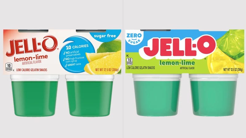
The popular gelatin brand has weathered over a century of changes in the marketplace and remains a big seller, and as you can imagine, it has gone through a number of changes to its marketing presentation.
Now, the latest shift ushers in a “new visual identity that positions the brand for relevance today and in the future among a new generation of parents,” according to a news release by Kraft Heinz.
The difference is noticeable right away in the new typeface, eschewing the sleek narrow lettering for big block lettering, with the “O” in “Jell-O” slightly raised from the rest of the letters.
Of course, flavor-wise, the recipe will remain the same, meaning a Jell-O by any other lettering will still at least taste as sweet.
Related
