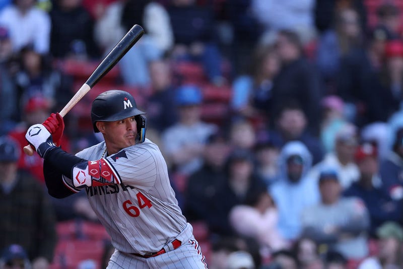

Not everyone appears to be a fan of the new Minnesota Twins rebrand, specifically, the new “M” design on the baseball caps, as the Yankees broadcast crew fired a couple of shots last night during the New York team’s loss in Minnesota.
“What is that?” Jeff Nelson asked as the Yankees broadcast showed the logo along the padding in the outfield.
Ryan Ruocco then said that the logo “looks like the Marlins ‘M,’” a common criticism delivered on social media by opponents and fans alike.
“It looks exactly like the Marlins’ ‘M,’” he continued. “I understand the star is supposed to be the Northstar, and that’s a thing here. But that is just dreadful.”
Nelson went on to say that the new Northstar logo looks like it should be a “college” logo.
The rebrand was announced at the conclusion of last season as the team introduced new jerseys and hats, along with a redesign of a few classics.
However, Nelson and Ruocco brought attention to a point that many who dislike the new designs have.
“The ‘TC’ is awesome, and you had an ‘M,’” Ruocco said, as Nelson agreed, calling the old team logos “iconic.”
Agree with the take or not, the Twins laid the smackdown on the Yankees Monday night, picking up a 6-1 win to improve to 13-10 on the year and maintain its claim of first place in the AL Central.
The Twins are set to take the Yankees on again today at 6:40 p.m.
Related

Related
