


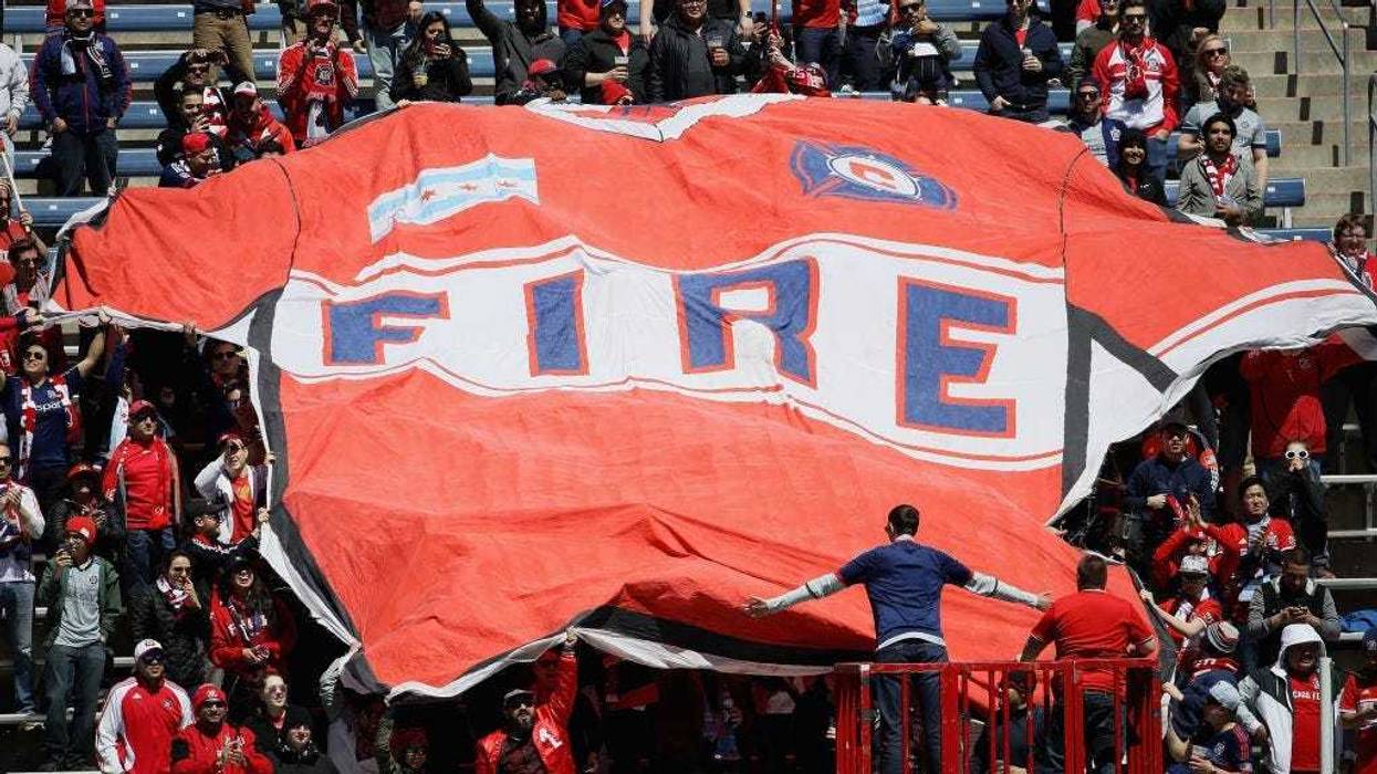
97.1 The Ticket -- The Chicago Fire have been around for most of Major League Soccer's existence. Formed in 1998, the club's badge, or logo, has been unchanged for two decades.
For good reason. The Fire have had one of the cleaner, most recognizable and most enjoyable badges in the league. It resembled a fire department badge and fit nicely somewhere between a traditional American sports logo and a European soccer -- err, football -- crest.
When the club unveiled a new look on Thursday, fans were not happy. Not only is the logo a major downgrade for the club's identity, the forced connection to the Great Chicago Fire of 1871 that destroyed most of the city seems ill-advised.
MLS: Chicago Fire FC reveal disappointing new logo.Details: https://t.co/4h5aAwFlgX pic.twitter.com/UWYsSI1nEx
— Chris Creamer (@sportslogosnet) November 21, 2019------ ---------- ---- --------------'-- ----------. pic.twitter.com/uCpz211gjs
— Chicago Fire FC (@ChicagoFire) November 21, 2019There was quite the uproar on social media Thursday, with most everyone preferring the club's original look.
This is the worst badge in the history of football
— Danny Z (@Zwerls2) November 21, 2019nah...... this one is still better. The OG will always be a better representation of what Tradition, Honor and Passion stand for instead of some marketing garbage thought of in an office somewhere that probably wasnt even in Chicago when this abomination was given life pic.twitter.com/PAjqQWzAw6
— Mario Damico (@damico2414) November 21, 2019A reminder of why the original Chicago Fire logo was made as it was. #cf97 pic.twitter.com/qxI0L506rP
— Matthew Verive (@MatthewVerive) November 21, 2019The graphic designers behind the new Chicago Fire logo should be fired immediately. pic.twitter.com/SAs8L2S3pQ
— THE TH--NKF----L P--L--K (@TheFunkyPolak) November 21, 2019The change in identity comes as the club moves forward under new ownership. After playing at a soccer-specific stadium in Bridgeview, the club will be moving back to playing its games at Soldier Field, home of the NFL's Chicago Bears.
To make matters worse, the logo was reportedly designed by an agency from New York -- a big slap in the face to Chicago.


