
Buffalo, N.Y. (WGR 550) - A couple of seasons ago during the pandemic-shortened 2020-21 season, the National Hockey League introduced a brilliant concept of teams bringing back one vintage or retro jersey from their past and applying a current day twist to the uniform.
The league and adidas introduced the jersey line as the "Reverse Retro" series.
For those who enjoyed the line of jerseys released in the original series a couple years back, there's good news: The NHL and adidas have officially released another series of "Reverse Retro" jerseys for all 32 teams for the 2022-23 season.
This series of "Reverse Retro" jerseys will be worn a number of times this season, with the Buffalo Sabres wearing their rendition of the blue and gold "goathead" jersey a total of eight times in the 2022-23 campaign.
Some of the jerseys in the 2022 edition of "Reverse Retro" are, like the first go-around, classics that teams have brought back with the current twist. Others brought back some old, yet, controversial jerseys that have been spruced up from the previous rendition.
Meanwhile, some teams did an alright job with their second "Reverse Retro" look, while others completely dropped the ball in coming up with a unique concept.
Which teams came away with the best jerseys, and which teams ended up flopping?
Brayton Wilson and Josh Schmit have teamed up to provide their thoughts on this season's line of "Reverse Retro" jerseys, courtesy of a tier list:
----------
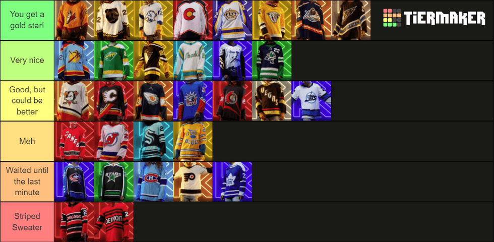
JOSH:
Tier 1: You get a gold star!
Buffalo Sabres:
Beautiful job. I always loved the "goathead" as a kid, and now we're getting not one, but two "goathead" jerseys this year. The blue and gold "goathead" was always an interesting concept that I wondered why the team never explored.
Now it's here, and it's amazing. The detail in the buffalo head, the nod to the original design of the black and red "goathead", right down to the "B" with the sword through it on the shoulders.
Washington Capitals:
Watching a young Alex Ovechkin fly down the ice with the "screaming eagle" blowing in the wind was one heck of a sight on the low quality cameras of 2005-06. Now, almost 20 years later, we get to see an old Ovechkin still fly down the ice with the screaming eagle blowing in the wind.
However, this jersey will be interesting for Washington goalies to match their pads and helmets with.
Colorado Avalanche:
The Avalanche had a great jersey the last go-around when they paid homage to the Quebec Nordiques. This time, they give back to their great state of Colorado.
The reigning champs executed this jersey very well, incorporating not only the colors of their state flag, but the insignia, and even a note of mountain tops in the bottom stripes of the jersey.
Great way to give back to the Colorado faithful.
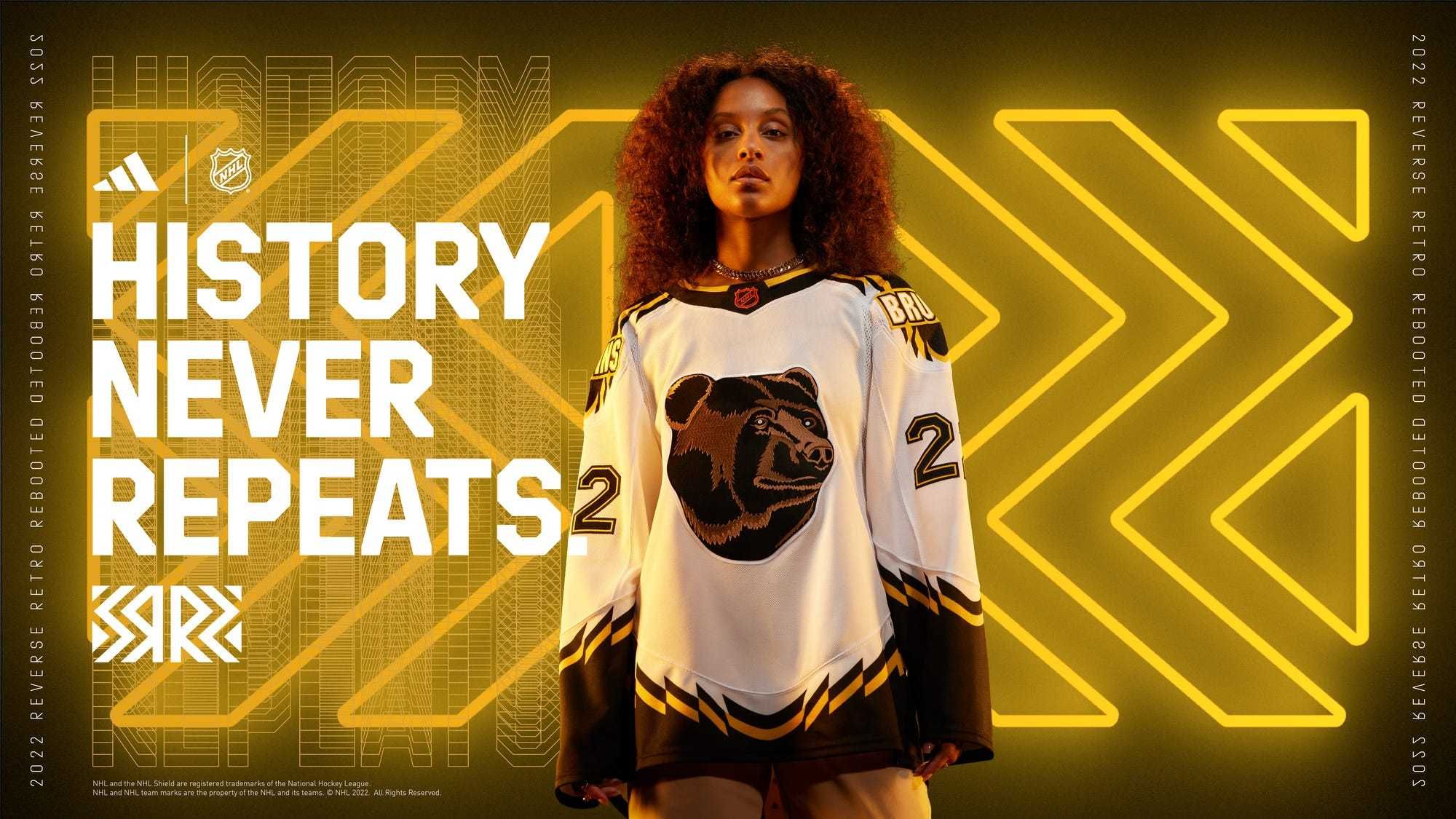
Boston Bruins: "Pooh bear" is back, and better than ever
Los Angeles Kings: Purple and gold looked great last time around, and this looks even better.
New York Islanders: The "Fisherman" jersey used to be mocked, but it's good to see it back.
Arizona Coyotes: I wasn't a big fan of the purple jerseys in 2020, however, these are much better. If only their on-ice product matched this.
Nashville Predators: This is the only acceptable all-yellow jersey in the whole league. Case closed, no extra comments.
----------
Tier 2: Very nice
San Jose Sharks:
Going back to their roots, calling on the first NHL California team that no one remembers, the California Golden Seals.
The mix of the original look of the Golden Seals, along with the iconic teal of the Sharks matches much better than I would have guessed, and fits well with the return of the teal uniforms.
Vancouver Canucks:
I always forget that the Canucks had this as an alternate logo at one point in time, but it really shouldn't have ever gone away.
The color scheme is very comparable to the colors of 2020, minus the gradient fade, but it works very well. The numbers on the chest are a bit much, though.
Minnesota Wild: Another year, another Minnesota North Stars reference. Spoiler alert, it still works.
Florida Panthers: This is another alternate logo making an appearance in this tier, and it works really well with the sky blue background. Very Florida.
Pittsburgh Penguins: Any jersey that brings back memories of Mario Lemieux and Jaromir Jagr (and his mullet), it's a good jersey.
Tampa Bay Lightning: This is a perfect combination of nature and hockey.
----------
Tier 3: Good, but could be better
Almost all of these teams have great logos from back in the day that can be utilized in so many ways, but they fall just short of being great.
Winnipeg Jets: The look of the original Jets logo is great, but something about these colors just don't do it for me.
New York Rangers: These jerseys just bring me back to Henrik Lundqvist, and that's the only reason they made it this high.
Anahiem Ducks: Don't try to make your team look like Daffy Duck. Still, a great logo, though.
Ottawa Senators: I love the old logo, but then I think of the 2007 Stanley Cup Playoffs and I get mad. It loses points.
Vegas Golden Knights: I'll say this, the team doesn't have a lot to work with, being so new, but it's not bad. However, slanted text is so overused.
Also, why glow in the dark? When are you going to play in the dark?
Edmonton Oilers: Despite popular belief, I thought the "oil drop" jersey was always interesting and unique. That being said, the orange on this jersey doesn't do it for me. Anymore white and you enter creamsicle territory.
Calgary Flames: The pedestal jersey just doesn't do it for me. The slant makes me thing they didn't use a ruler the first time.
----------
Tier 4: Meh
These jerseys were just very mediocre, to my eye. They didn't have as much creative vision and lacked a specific direction.
Seattle Kraken: Much like Vegas, the team doesn't have many logos to work with, but dig deep. Dust off the history books and see if there's something cool with the old Seattle Metropolitans.
Also, too much teal.
St. Louis Blues: See above in the Nashville category.
New Jersey Devils: While this is a vast improvement from the Devils' alternate "Jersey" jersey, the attempt to include the Kansas City Scouts is appreciated, but not well-executed.
Carolina Hurricanes: As I said before with Vegas, slanted text is overused in the NHL. Plus, I believe there still could be untapped potential in a different kind of Hartford Whalers jersey.
----------
Tier 5: Waited until the last minute
This tier is exactly what the title says. These teams simply didn't try designing anything new and fun. They rushed to get something in at the last minute.
Philadelphia Flyers and Montreal Canadiens: These two teams simply slapped a logo on a jersey with slightly different colors and stripes, and called it good.
Props to the Flyers, though, for bringing back the orange and black Cooperalls. Too bad they'll only wear them in warmups.
Toronto Maple Leafs: Are we sure this isn't just their normal home jersey?
Dallas Stars and Columbus Blue Jackets: If the Stars would have also put stars on their sleeves, the two jerseys would be twins, minus the green and blue.
----------
Tier 6: Striped Sweater
Detroit Red Wings and Chicago Blackhawks:
These jerseys are nothing. They should never see the light of day, and it's shocking I've written this many words about them.
To finish it off with one word: Red.
 Tiermaker
**********
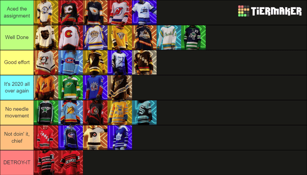
BRAYTON:
Tier 1: Aced the assignment
Buffalo Sabres: It has been a perfect 2-for-2 with "Reverse Retro" concepts for the Sabres. After going blue and gold with the 2001 "butterknives" jerseys in 2020, they kept it simple, but perfect, to alter their "goathead" jerseys with the blue and gold color scheme.
It's the year of the "goathead" for the Sabres, as they also get set to reveal the return of the black and red "goathead" look in November.
Calgary Flames: While the pedestal jersey is certainly not the Flames' best look, this concept with the black base is very, very sharp. It allows for the red, yellow and white of Calgary's primary color scheme really stand out, including the white-based primary logo on the chest.
Edmonton Oilers: The Todd McFarlane third jersey of the early 2000s was certainly a unique and different look for an Oilers team that has been known to keep things close to tradition with their logo and color scheme.
While the navy base could've easily been changed to the current shade of blue for the base, the touch of orange added to the McFarlane jersey is perfect. A good change in the return of the "oil drop" jersey.
New Jersey Devils: A perfect throwback to the roots of the Devils organization when they started out in Kansas City as the Scouts in 1974. The color scheme of the scouts with the current look of the Devils meshes so well for a "Reverse Retro" concept. Simple, and executed extremely well.
Winnipeg Jets: OK, hear me out. This may very well be the best "Reverse Retro" jersey in the 2022 line of jerseys.
First, the 1990s Jets logo is far-and-beyond the best Jets logo, past and present. Second, the white base for the jersey was the right way to go. And while the current colors did not go well with the first "Reverse Retro" rendition for Winnipeg, this time it slaps.
Compliments to the chef on this concept.
----------
Tier 2: Well done
Boston Bruins: While the "Pooh bear" jersey concept is much maligned by many hockey fans, the original yellow-based jerseys were incredibly fun and good for its time. Looking back now, they are still great.
Even though the white-based "Pooh bears" are not as perfect as the yellow-based jerseys, I can still dig this look.
Colorado Avalanche: A very nice throwback by the Avalanche to not only honor the original Colorado Rockies, but it pays more homage to the Colorado state flag. Even the nice little mountain outline in the bottom border of the jersey is a great touch.
This will one day serve as more than just a "Reverse Retro" jersey for the Avalanche, as should be.
Los Angeles Kings: The 2020 "Reverse Retro" concept for the Kings was, by far, the best jersey released in that line. Change my mind. (You can't.)
It was hard for them to be able to replicate how perfect the 2020 look was, but these jerseys are still incredibly nice looking. While a white base for this era of Kings jersey seems like some bad juju, it really looks sharp with the purple and gold trim.
Nashville Predators: The 2001 mustard yellow Predators alternate jersey was so awful back then, they were perfect. If that makes sense...
While a navy blue base may have fit the bill much better for this concept, the current yellow base for these jerseys are perfect. May not be the best "Reverse Retro" concept this year, but it's good.
New York Islanders: The "Fisherman" look has returned, and it's long overdue! It's also a massive upgrade from the concept of 2020 that, well, was nothing throwback or retro. Please don't let these jerseys slip back into oblivion again.
San Jose Sharks: It's a great look to throw it back to the California Golden Seals, the first hockey team based in California.
While this concept maybe could have been executed a bit differently to make it even more perfect, anytime you can throw it back to the days of the Golden Seals is pretty awesome.
Vancouver Canucks: A throwback to the days of the Canucks of the Western Hockey League with "Johnny Canuck" as the team's primary logo. Truly a classic look that is a slight alteration of what the Abbotsford Canucks currently wear in the AHL today. Nicely done.
----------
Tier 3: Good effort
Anaheim Ducks: The Ducks need to return to their Mighty Ducks era of logo, no one will doubt that statement.
This fits the bill as a suitable away jersey if the Ducks ever make the full-time switch to this concept. The orange-based third jerseys or a black-based jersey would be suitable as a home jersey.
Montreal Canadiens: The Canadiens have one of, if not the oldest, unchanged logos in sports history, and their uniforms have not changed much at all either.
With that being said, nice of the team to throw it back to a Montreal Expos look with the Baby Blue jerseys. Looks like it was executed well, but certainly a one-off.
Pittsburgh Penguins: Always loved the "Robo Penguin" look of the late 1990s and early 2000s, and it definitely doesn't get enough love from the hockey world.
It's about the only reason I have this jersey ranked this high, because the jersey base is nothing to speak too highly of. It's not bad, but it's not great.
Tampa Bay Lightning: Execution of this "Reverse Retro" concept was almost there on this one. Instead of the white base, which is not great, why not a gray or black base?
I don't care that many people hate this jersey, it slaps as a great '90s look, and I would give anything to have one of the originals in my possession.
Vegas Golden Knights: The Golden Knights didn't have much to go off the first time around with "Reverse Retro", and same thing goes in 2022. Vegas even admits on its website, "The team has opted to honor its home city and the history of Vegas as it's throwback theme."
While I could do without the "Vegas" wording diagonally across the chest, it's particularly neat that the jerseys glow all kinds of different colors in the dark. Makes for a fun jersey to wear if you're taking in the night life in Vegas after the game.
----------
Tier 4: It's 2020 all over again
Arizona Coyotes: Listen, the Coyotes' purple "Reverse Retro" jerseys in 2020 were fantastic, maybe one of the best concepts that came out. These sunset, desert-colored uniforms in 2022 may be just as nice. Not sure if it will work on the ice, though.
They could make a "Reverse Retro" concept with this jersey in any color, and think it may work very well. Don't push it, though.
Minnesota Wild: As I said in 2020, love the inclusion of the Minnesota North Stars color scheme, but why not use their old logo?
Also feel like this is just the coming to fruition of some horrible knockoff jerseys that have been attempted to be sold for outrageous prices on eBay.
New York Rangers: Love the "Lady Liberty" look, but not in anything other than navy blue. 2020 saw the look come back in an updated way. Fantastic. This time around: Meh.
Washington Capitals: I love the "screaming eagle" jerseys for Washington, and these colors are brilliant. It's a throwback to the Capitals' 2005-06 home jerseys that Ovechkin wore as a rookie.
I wanted to throw this near the top of the list, because they are that great, but rules are rules in this tier.
----------
Tier 5: Not moving the needle
Dallas Stars: A massive upgrade from their 2020 rendition of their "Reverse Retro" jersey. It's just as simple as bringing back their old logo and applying their current Victory Green color. They just won't do it, though.
Florida Panthers: As much as I am a fan of '90s hockey logos and a Baby Blue combination, this look for the Panthers isn't quite doing it for me. That may change once we see this uniform in action on the ice.
Ottawa Senators: A combination of the old/new Senators logo and the jersey design of the 2006-07 era in Ottawa. Yeah, I've got nothing.
St. Louis Blues: This is a yellow-based jersey of a concept that was designed before the team even dropped the puck for a regular season game. While that's neat and all, that yellow base is just so not Blues.
Yes, yellow is actually one of the primary colors for the Blues, it should never be the primary base color for any of their jerseys. It's better than a red base, I guess.
Seattle Kraken: While Seattle doesn't have many options, they chose to honor the Seattle Ironmen, according to the team's website. A lot of teal and navy blue that kind of just blend in all together without any contrast.
We'll give them an "E" for effort. Maybe a tribute to the Seattle Metropolitans next time?
----------
Tier 6: Not doin' it, chief
Carolina Hurricanes: It's a combination of their awful "Canes" white uniforms and their return of their 2005-06 uniform. Not the worst, but it's near the bottom of the list.
Side note: That 2005-06 season ended after Game 6 of the Eastern Conference Final. Nothing happened after that game.
Columbus Blue Jackets: A throwback to their original change in 2003 to their modern primary logo of today. Nothing special, though. Move along.
Philadelphia Flyers: Did you even try, Philadelphia? Cool to bring back the Cooperalls, though.
Toronto Maple Leafs: Asking the same thing of Toronto. Although, their 2022 edition is still lightyears better than the 2020 massive monstrosity that was that Maple Leafs logo.
----------
Tier 7: DETROY-IT
Neat of the Red WIngs to try and incorporate black into any of their uniforms (a throwback to the Detroit Cougars days), but this certainly is not the way to do it. Two-straight "Reverse Retro" failures for Detroit.
While Chicago's concept is more of a legitimate throwback, it's still a poor output. Not as terrible as the Red Wings' jerseys, but still bad.
 Tiermaker