


So far this year on Audacy Sports, we've ranked both the best overall uniform sets in Major League Baseball, and the sport's best alternate uniforms.
Today, we're going to look at the best -- and worst -- of MLB's "City Connect" uniforms, a program that began in 2021 and aims to give each team an alternate uniform by the conclusion of the 2023 season.
This countdown will be updated as more teams release their "City Connect" uniforms, but at the time of publication, 11 teams have done so. Here's a look at how those franchise's attempt at outside-the-box uniforms have gone:
11. Los Angeles Dodgers
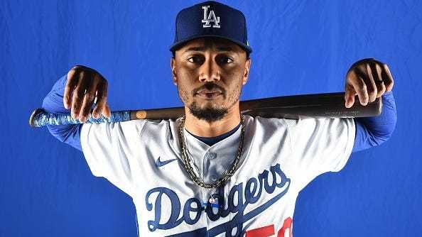
 Will Smith and Blake Treinen model the "City Connect" uniforms of the Dodgers.(Kevork Djansezian/Getty Images)
There are some teams who have such classic uniform sets that it feels sacrilegious to even force them to add an alternate as part of a program like this. In addition to the Detroit Tigers and New York Yankees, the Dodgers would seemingly fall into this category. It's one thing for the Dodgers to wear a dark blue top in Spring Training. It's another to bring it into the regular season and add dark blue pants. The Dodgers would be wise to leave these uniforms in 2021 and never look back.
10. Chicago Cubs
 Kyle Hendricks models the Cubs "City Connect" uniforms.(David Banks/Getty Images)
If you're thinking about adding a navy-blue-on-navy-blue alternate, don't. And while there's probably enough teams with powder blue uniforms already, the Cubs would have been wiser to try to create powder blue uniforms than use it as a secondary color to navy blue. "Wrigleyville" across the front of these uniforms actually works. Unfortunately, not much else about them does.
9. Kansas City Royals
 Bobby Witt Jr. models the Royals' "City Connect" uniforms.(Jamie Squire/Getty Images)
So you know what we were just saying about navy blue, and trying to mix it with powder or baby blue? The Royals get some points here for utilizing white pants instead of navy blue ones, but their attempt to pay homage to playing in "The City of Fountains" ended up being pretty bland.
8. Boston Red Sox
 Xander Bogaerts and Rafael Devers model the "City Connect" uniforms of the Boston Red Sox.(Jim Rogash/Getty Images)
The Red Sox caught fire last September while wearing their yellow "City Connect" tops, which led to WEEI's Rob Bradford confirming that the team had clearance to wear them in the postseason if they chose to do so. But ultimately while we respect the Red Sox paying homage to the Boston Marathon, yellow isn't a very good color for a uniform. The same goes for the "617" on the left sleeve -- having a number definitely fits the theme of being in a marathon, but it's not an especially creative idea to put an area code on a uniform.
7. San Francisco Giants
 Logan Webb models the "City Connect" uniforms of the Giants.(Thearon W. Henderson/Getty Images)
These aren't perfect, but they are at least fun. The Giants' "City Connect" uniforms -- which are supposed to represent San Francisco peaking out from behind the fog in the Bay Area -- are an interesting concept. Given that the Giants already have some of the best uniforms in baseball, could the world have lived without these? Probably, and there are subtle improvements that could be made, like removing the Golden Gate Bridge from the right side of the hat. But we generally like the creamsicle color, and the matte batting helmets worn with these uniforms look pretty cool.
6. Houston Astros
 Alex Bregman models the "City Connect" uniforms of the Houston Astros.(Bob Levey/Getty Images)
We're torn here, because on one hand, we've noted above that navy-blue-on-navy-blue isn't generally a very good look. But paying homage to Houston's history in space exploration is a fun fun idea, and both the logo utilized on the hat and colors use to write out "Space City" and the individual player's number on the right side of the pants keep it from being bland. While we might have based the "City Connect" uniforms around the Astrodome, these aren't bad.
5. Chicago White Sox
 Jose Abreu models the "City Connect" uniforms of the Chicago White Sox.(Jonathan Daniel/Getty Images)
These have been among the most popular in the "City Connect" uniforms, but you can still find plenty to critique about them too. The black pinstripes are at least unique, and the sock logo on the left sleeve is the best feature that the White Sox have in their uniform set. But if someone said that a uniform that reads "Southside" across the front and "Chi" on the hat looks more like something that should be sold by a vendor outside the stadium than one actually used for game action, we'd have a tough time arguing with that.
4. Arizona Diamondbacks
 Zach Davies models the "City Connect" uniforms of the Arizona Diamondbacks.(Norm Hall/Getty Images)
Teams who typically have bad uniforms actually have an advantage on this list, because anything different from what they usually wear is a welcome change of pace. Prior to the season, we ranked the Diamondbacks' uniform set as the third worst in baseball, suggesting that they should permanently return to purple and teal. Given how uninspiring "sedona red" is, the "City Connect" uniforms feel like an improvement. The sand color isn't as in your face as some of the other uniforms on this list, but it definitely avoids being boring. And "Serpientes" across the front looks much better than if they had gone with "Snakes" or "D-Backs."
3. Washington Nationals
 Keibert Ruiz models the City Connect uniforms of the Nationals.(Mitchell Layton/Getty Images)
People like to complain about gray, but this shade works well with the design that the Nationals use, especially since they didn't try to add matching gray pants. The Nationals also deserve credit for building these uniforms around the cherry blossoms you see in D.C. in the spring, rather than the the obvious of a political monument that wouldn't have translated well to a uniform. Even if many teams only end up only wearing their "City Connect" uniforms for a year or two, the Nationals should consider adding these as a permanent alternate.
2. Colorado Rockies
If you miss the obnoxiously large logos featured on NBA jerseys in the 1990s, these uniforms are for you. These kind of feel like a hybrid of the Utah Jazz and Milwaukee Bucks' 1990s uniforms. And you know what? We really like them. The Rockies did put forest green on forest green, but the top of the jerseys are white, as are the sleeves and the front of the hat. Purple works for the Rockies on their alternate jerseys, but it would have been too much as the primary color for these uniforms. The Rockies probably could have just put their typical "CR" logo on the front of these hats, but overall, we give them strong marks for their "City Connect" uniforms.
1. Miami Marlins
 Jorge Soler models the "City Connect" uniforms of the Miami Marlins.(Eric Espada/Getty Images)
The Marlins have arguably the worst uniforms in baseball right now, so like we said above with the Diamondbacks, we're inclined to like it when they do something different. Very few teams can pull off red tops, but in a stadium without much life, the pinstriped red tops that pay homage to the Cuban Sugar Kings add some much needed vibrance. The caps and matching helmets -- which feature "Miami blue and legacy red" -- are the best part of the uniform. The Marlins are wearing these uniforms for all Saturday games at loanDepot park in 2022 beginning on May 21.
LISTEN NOW on the Audacy App
Sign Up and Follow Audacy Sports
Facebook | Twitter | Instagram