

CLEVELAND, Ohio (92.3 The Fan) – Rebranding a franchise is more than just the name.
There’s the logos and uniforms too.
The team's red, white and blue color scheme will remain but the wordmark script and block C were tweaked to evoke the architecture of the Hope Memorial Bridge, home to the guardians of traffic that stand tall mere steps from the gates of Progressive Field.
Here's how the team describes their new look:
CONTINUITY
COLORS REMAIN: Our team colors will remain the same scheme that has been part of our organization for more than 80 years to honor our rich baseball heritage as well as the tradition of baseball as America’s pastime
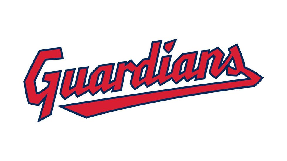
SCRIPT WORDMARK RETURNS: The new Guardians wordmark will have a familiar script style of the last 75 years while evoking the structural architecture of the Hope Memorial Bridge, mimicking the trusses of the bridge’s underside
HOME/ROAD UNIFORMS: The Club will continue to wear CLEVELAND on the road uniforms, featuring our Bridge Print alphabet derived from the Diamond C, and the Guardians script wordmark on the home uniforms
EVOLUTION
‘C’ EVOLUTION: Our new “Diamond C” will be an evolution of the Block C and respects the tradition and heritage of Cleveland Baseball. The new C stands tall – just as the Guardians of Traffic stand watch over our ballpark and city – and draws from the ascending diamond motifs at the top of each Guardian pylon. The weight of the C is bold and its tapered shape is inspired by letterforms from the 1920 and 1948 World Series clubs
NEW LOGOMARK: The Guardian’s Fastball embodies what it means to be a Cleveland Guardian in its strong, yet simple design. It is inspired by the helmets and wings of the Hope Memorial Bridge’s Guardian statues and the G purposefully wraps around and guards the baseball. The split-finger design is a tribute to our strong pitching heritage
Scroll down and take a look at the Cleveland Guardians’ new look that will debut in 2022.
![]() The Cleveland Guardians primary logoCleveland Guardians/MLB
The Cleveland Guardians primary logoCleveland Guardians/MLB
 The Cleveland Guardians wordmarkCleveland Guardians/MLB
![]() The Cleveland Guardians new block C logo which will adorn the team's hats and helmetsCleveland Guardians/MLB
The Cleveland Guardians new block C logo which will adorn the team's hats and helmetsCleveland Guardians/MLB
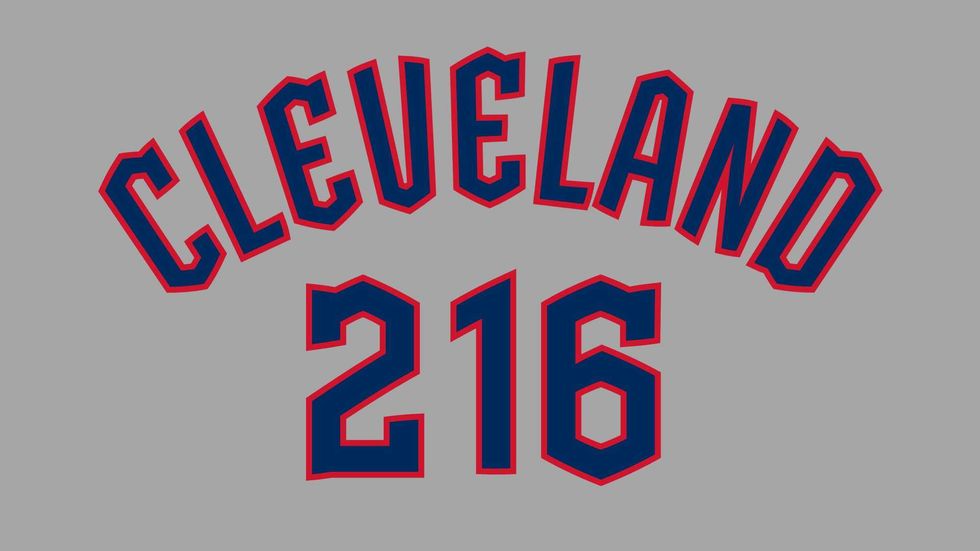 Cleveland Guardians 'Cleveland' wordmark and numeric fontCleveland Guardians/MLB
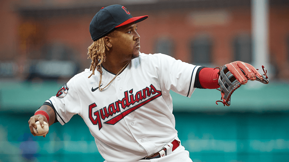 A mockup of the Cleveland Guardians new home white uniformCleveland Guardians/MLB
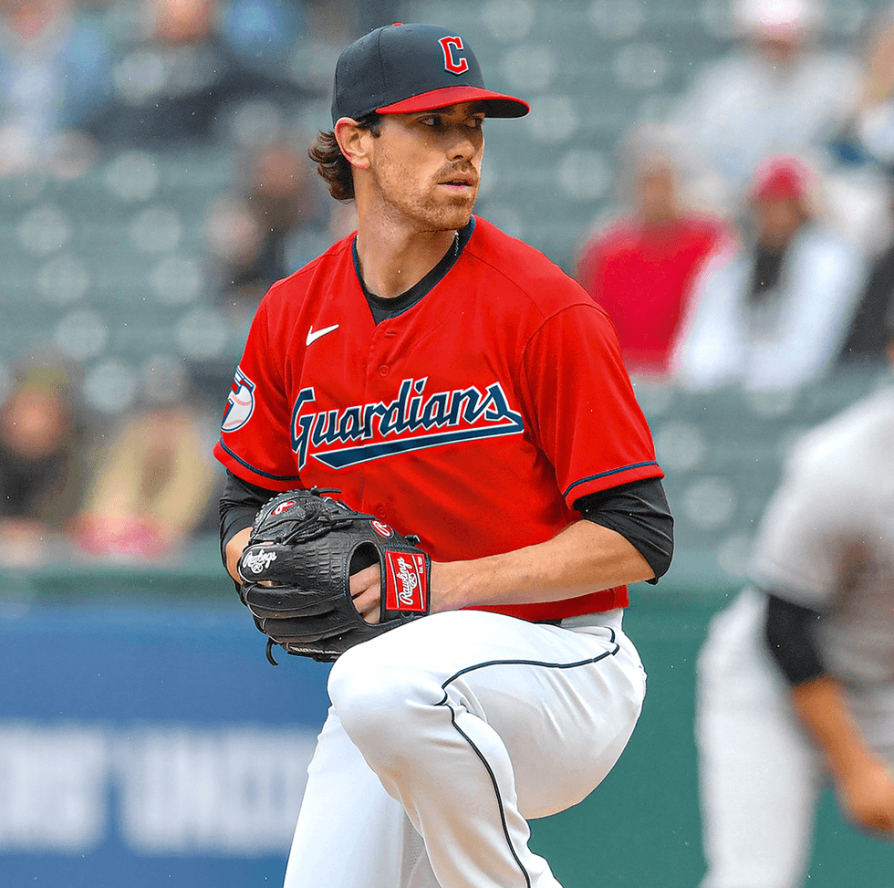 A mockup of the Cleveland Guardians alternate red uniformCleveland Guardians/MLB
 A mockup of the Cleveland Guardians alternate blue uniformCleveland Guardians/MLB
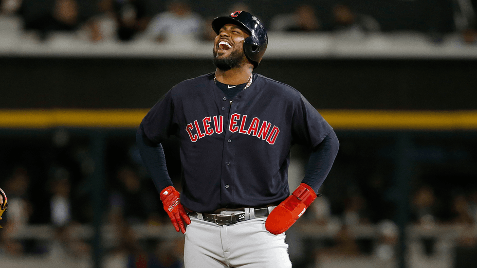
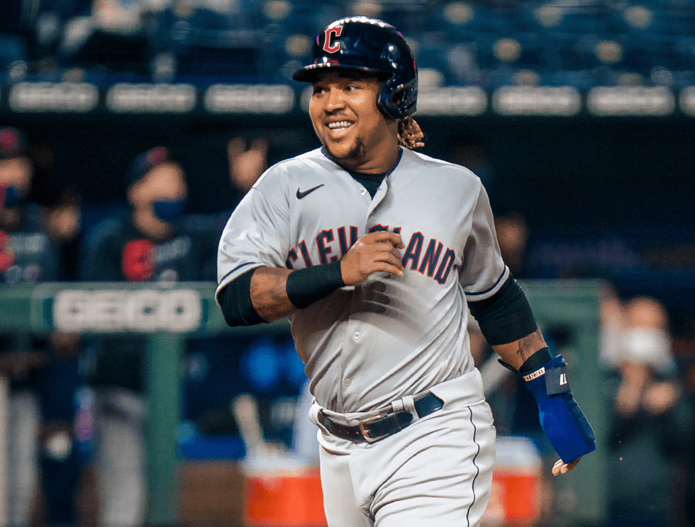 A mockup of the Cleveland Guardians grey road uniformCleveland Guardians/MLB


