


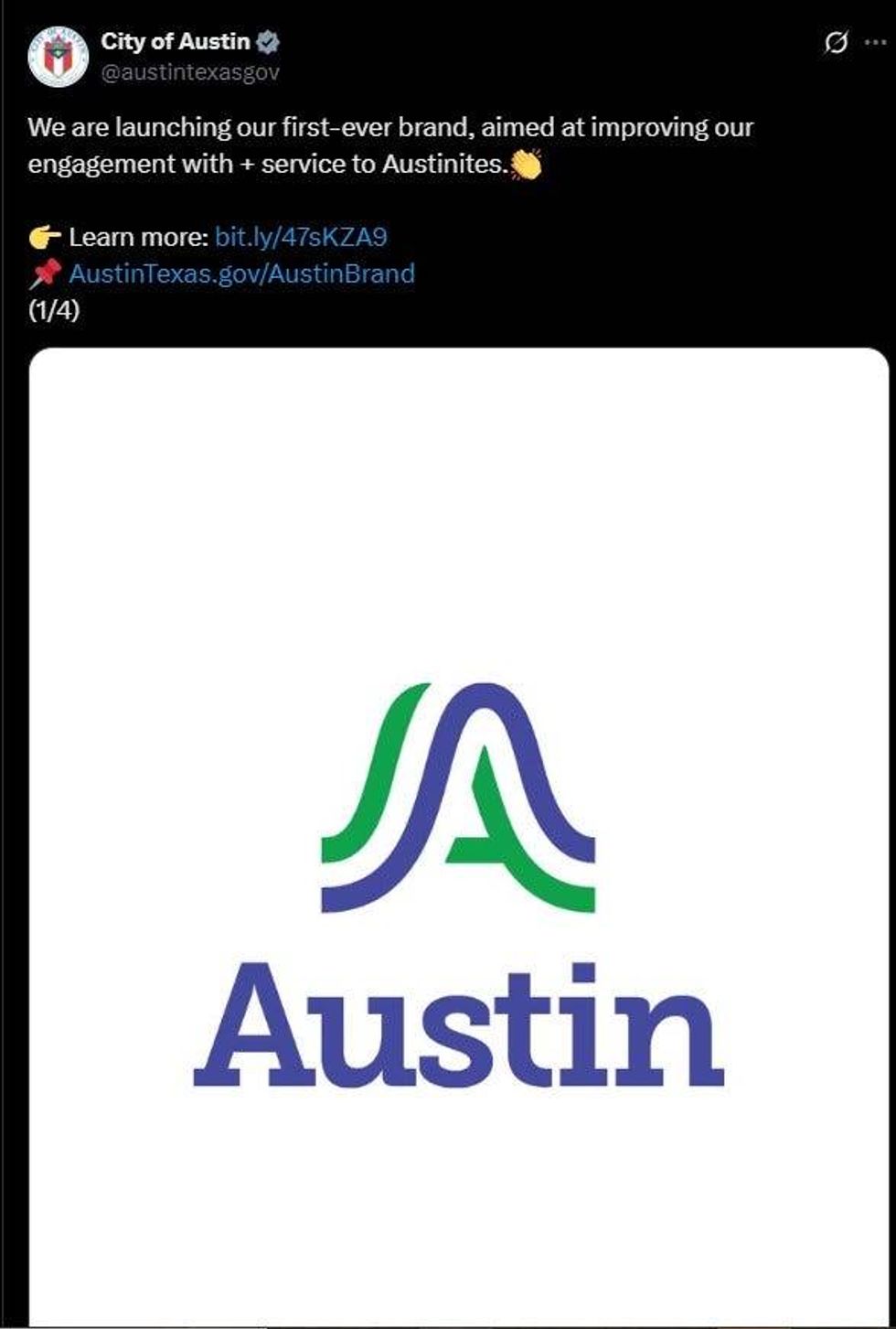
AUSTIN - After seven years in the works and roughly $1.1 million in public funds, the City of Austin is rolling out its first official, unified logo on October 1.
Designed with input from Austin-based firm TKO and global agency Pentagram, the stylized blue-and-green "A" is meant to symbolize the region's hills, rivers, and bridges through a clean, modern aesthetic.
City Manager T.C. Broadnax says the rebrand aims to replace some 300 department-specific logos with one cohesive mark, making city messaging instantly recognizable across websites, vehicles, newsletters and more - though uniforms for public safety will stay the same for clarity.
 After seven years in the works and roughly $1.1 million in public funds, the City of Austin is rolling out its first official, unified logo on October 1.X
But Austinites aren't exactly embracing it. On Facebook, Donna Arwood wrote, "I find this a Cracker Barrel attempt… the result kind of lame. The current city logo is somewhat stale, I agree. But … it's better than this."
Reddit users jumped in too, likening the logo to "Albertsons" (the supermarket), and calling it "corporate and soulless" - a far cry from Austin's "Keep Austin Weird" identity.
![]() The old Austin logo that's being replacedCity of Austin
The old Austin logo that's being replacedCity of Austin
That said, not all feedback was negative. Ricardo Garcia, a 10-year Austin resident and UT grad, told CBS Austin, "It looks cool. I like it. I like the waves. I like the lines."
Others, like Itati Garza, questioned the timing, asking whether the money might have been better spent on pressing needs like housing or infrastructure - especially with a tax rate election on the horizon.
LISTEN on the Audacy App
Tell your Smart Speaker to "PLAY 1080 KRLD"
Sign Up to receive our KRLD Insider Newsletter for more news
Follow us on Facebook | Twitter | Instagram | YouTube


