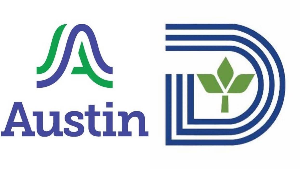
Austin's newly unveiled city logo is already sparking criticism, with some residents saying it looks a little too familiar.
The design, a wavy blue-and-green "A" meant to symbolize hills, rivers, and bridges, is part of a $1.1 million rebranding effort to unify the city's government identity. But critics quickly noticed its resemblance to Dallas's own stylized blue "D," which features a green leaf at its center.
Dallas's logo, created in 1972, is often praised as one of the strongest city logos in the country, balancing simplicity with a nod to growth and sustainability. For more than 50 years, the emblem has become a recognizable part of Dallas's civic identity.
The comparisons between the two cities are heightened by another connection: former Dallas City Manager T.C. Broadnax. After stepping down in Dallas earlier this year, Broadnax accepted the city manager role in Austin, where he is now overseeing operations - including the rollout of the new branding.
Austin officials say the new logo was designed to represent the city's unique natural features and modern outlook. But on social media, many residents are questioning whether the fresh look is original - or just a costly echo of their northern neighbor's long-standing mark.


