Ranking the MLB's 10 Greatest Uniforms Ever
It's funny how the perception of aesthetics can change over time.
In the Tampa Bay Rays' inaugural season of 1998, they wore uniforms that read "Tampa Bay" (road) and "Devil Rays" (home) across the chest in gradient writing with a giant stingray underneath it. The look was panned, and abandoned after just three seasons.
However, like the Toronto Raptors' dino jerseys, the original Devil Rays' look has aged very well. The now-Tampa Bay Rays have used the jerseys - and the stingray hats - as throwbacks over the past two years, and the reception in today's climate is much better than it was in the 1990s.
We're not ready to call the original Devil Rays' jerseys iconic yet, but anyone that criticized them in the late 1990s didn't have the best taste, because they were pretty cool uniforms.
With the Devil Rays' jerseys aside, let's take a look at the 10 greatest uniforms in MLB history:
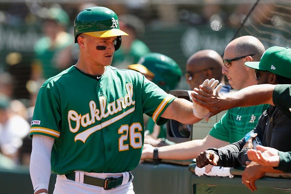
10. Oakland Athletics' Kelly Green Alternate Uniforms: 2018-Present
Like powder blue, it's hard to screw up a kelly green jersey. That said, the A's have perhaps perfected the kelly green look, so much so that players on the team have openly campaigned to expand the use of the uniforms beyond Friday evening games at RingCentral Coliseum.
The A's have flirted with different shades of green throughout the course of their history in Oakland, but these kelly green alternates - which feature cursive white font with yellow trim - hit the nail on the head. The team's elephant logo being featured on the left sleeve is a nice touch too.
If there's one complaint about this uniform, it's that the A's haven't yet given it a matching helmet. Their primary helmets are a darker shade of green, which doesn't match the kelly green jerseys. However, a kelly green helmet - perhaps a matte one - being introduced could move these jerseys up this list.
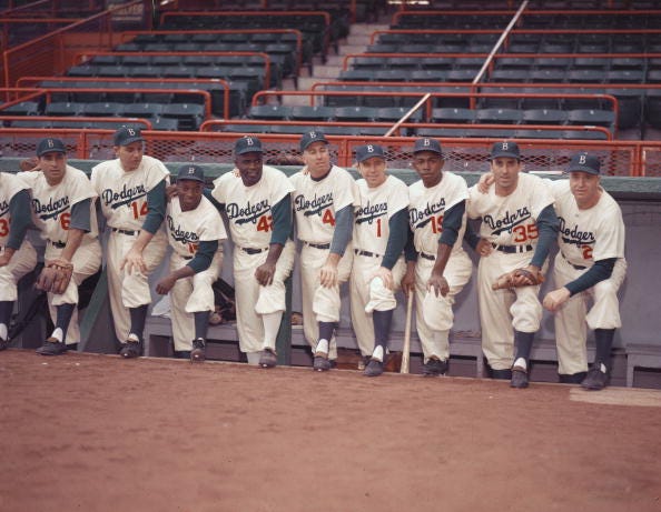
9. Brooklyn Dodgers' Darker White Home Uniform: 1952-1957
There's nothing wrong with the whiter home jerseys that the Los Angeles Dodgers currently wear, but the slightly darker shade of white that the franchise used for their final six seasons in Brooklyn utilized the perfect shade of white.
Interestingly, the Baseball Hall of Fame's exhibit "Dressed to the Nines" notes that these were the first major league uniforms to ever feature player numbers on the front of the jersey. Rather than sticking with blue for the number on the front of the uniform, Brooklyn elected to utilize a red number on the front of their home jerseys.
Though the shade of white has changed, the Dodgers' home jerseys have been pretty consistent throughout the course of their history. The red numbers that were introduced in 1952 are still worn on Los Angeles' home jerseys today.
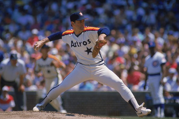
8. Houston Astros' Tamed Down Rainbow Uniform: 1982-1993
OK, so the rainbow jerseys that the Astros wore from 1975-1986 - both as the home and road uniform in some cases - were too much. They're a cool throwback uniform now, but as a primary uniform, they weren't a good look.
However, the Astros kept some of the rainbow look in the white jerseys seen above, which were initially introduced as an alternate jersey in 1982, and became the team's primary home jersey from 1986-1993. The jerseys balanced the rainbow look on the shoulders, but did so with a simple jersey that just read "Astros" across the front with a star.
With this look, the Astros used their current navy blue hat, which utilizes a white "H" over an orange star. Given the brutal navy blue and orange crush alternate jerseys that the Astros currently have, you wonder why they don't occasionally wear these throwbacks instead.
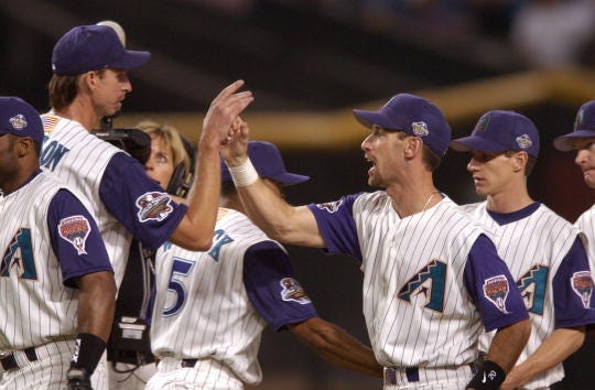
7. Arizona Diamondbacks' Purple and Teal Home Uniform: 2001-2006
The fact that the Diamondbacks occasionally wear these throwback jerseys is the only thing that saves them from having the worst uniform set in the sport. It makes you wonder why they ever moved away from this look.
From 2001-2006, the Diamondbacks wore these pinstriped jerseys with purple and teal as their primary colors for all their home games. They won their lone World Series title in 2001 while sporting this look, defeating the New York Yankees in Game 7 of one of the most classic series' ever.
Tank top jerseys generally haven't aged well, but these ones appear to be an exception. Even if the Diamondbacks had eventually ditched the tank-top look and just gone with the sleeved version of this uniform, it would have behooved them to stay with purple and teal. Baseball purists may not love those colors, but the Diamondbacks aren't an old-school team, so their jerseys should reflect that. As is, the team's black, grey and dark red uniforms are an ugly, uncreative look.
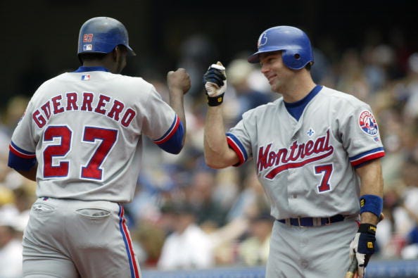
6. Montreal Expos' Road Uniform: 1995-2004
When the Montreal Expos left for D.C. in 2005, arguably baseball's best road jersey was retired.
A majority of baseball's team have grey road jerseys, but the Expos managed to include just enough color in their's without trying to do too much. The look featured cuffed red and blue sleeves, along with "Montreal" written in cursive across the front of the jersey. The team's primary logo, one of baseball's best ever, was also featured on the left sleeve and, of course, on a solid blue cap. Perhaps the best touch on the uniform is a small fleur de lis above the e in "Montreal," a nod to the city's french population.
The Expos wore this iteration of their road jerseys from 1995-2004, a time period where they only posted three winning seasons and were nearly contracted from the sport in 2002. Ultimately, they became the Nationals in 2005. Perhaps someday a team will return to Montreal and do these jerseys justice.
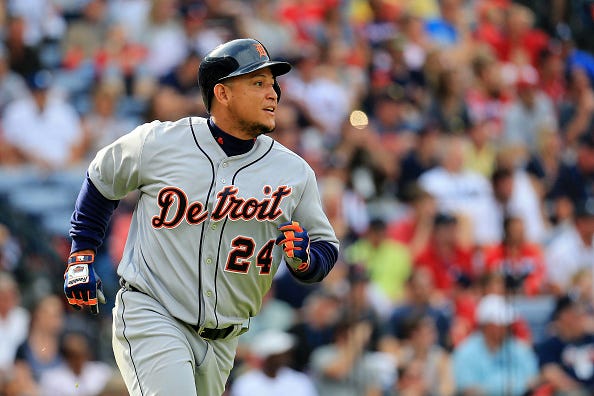
5. Detroit Tigers' Road Uniform: 1998-Present
The Tigers don't have an alternate uniform, and they don't need one.
Their white home jerseys are one of baseball's most classic looks, and the navy blue and orange jerseys with a cursive script are one of the best road jerseys that the sport has ever seen.
In 1972, the Tigers shifted to a blue and orange look on the road. The cursive "Detroit" script was introduced in 1995, but it was with a white jersey. That jersey - and the Tiger over the D hat - were short lived. In 1996, the Tigers first began wearing their current road jerseys, and completed it with the current navy blue hat with orange logo in 1998.
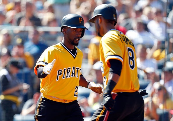
4. Pittsburgh Pirates' We Are Family Yellow Jerseys With Pillbox Hats: 1977-1984; 2016-2019
It's impossible to see these jerseys and not immediately think of "We Are Family" by Sister Sledge.
From 1977-1984, the Pirates wore these v-necked yellow top jerseys with a pillbox hat that had yellow lines the circled around the cap. Willie Stargell and 1979 World Series Champion Pirates are most associated with the yellow tops and pillbox caps.
In 2016, the Pirates reintroduced the yellow jerseys and pillbox hats, but managed to improve the look by adding black pants. The initial look featured either yellow pants or even brown pants, both of which were inferior looks to the black pants.
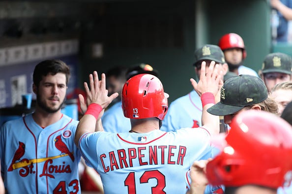
3. St. Louis Cardinals' Powder Uniform: 1976-1984; 2019-Present
Powder blue is once again all the rage.
However, with all due respect to the Philadelphia Phillies, Toronto Blue Jays, Kansas City Royals, Tampa Bay Rays, Minnesota Twins and Texas Rangers, all of whom currently have powder blue jerseys, the Cardinals' have the best powder blue jerseys in baseball currently.
The Cardinals initially wore these jerseys from 1976-1984 as their primary road jerseys. In 2019, the jerseys were reintroduced as an alternate road jersey. The only difference in the modern powder blue jerseys is that they read "St. Louis" on the front, rather than "Cardinals," like the initial ones did.
Don't tell anyone, but the Cardinals' powder blue jerseys - seen in the picture above - may just be the best of that color scheme in baseball history. We can't argue, though, if you prefer the powder blue road jerseys that the Montreal Expos wore from 1969-1991.
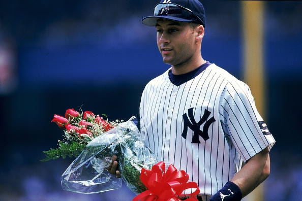
2. New York Yankees' Home Pinstriped Uniform: 1936-Present
With all due respect to the Mets' black jerseys, the greatest baseball uniform in New York history is the simplest one - the Yankees' pinstripes.
The Yankees have donned pinstripes as their home look since 1915. Initially, the jerseys featured the Yankees' logo on the left side of each player's chest, but the Yankees removed that from 1917-1935 and wore a logoless jersey that just had pinstripes. Since 1936, though, their home jersey hasn't really changed at all.
The team's current look has been the primary uniform that everyone from Joe DiMaggio to Derek Jeter to Aaron Judge has worn, and it's one of the most iconic looks in sports history.
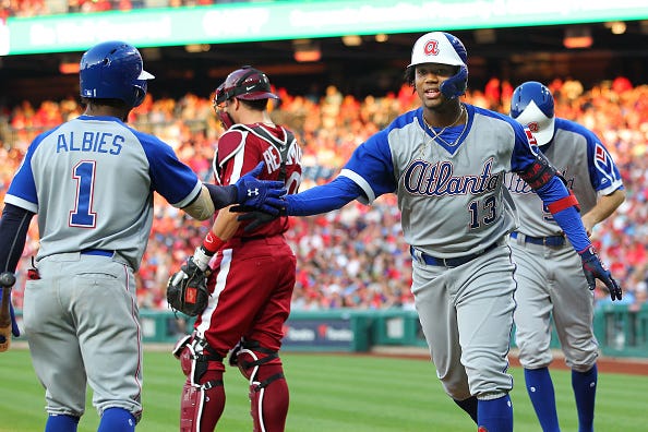
1. Atlanta Braves' Throwback Road Uniform: 1976-1979
The white home jerseys that the Braves wore from 1972-1975 - the ones that Hank Aaron broke the home run record while wearing in April of 1974 - could very easily find themselves in this spot. However, we're slightly more partial to the road jerseys that matched.
The road jerseys kept the white and blue hat synonymous with home jerseys, but the grey jerseys that read "Atlanta" across the chest perfected the best uniform in MLB history. This uniform was only the primary road jersey from 1976-1979, strangely.
On July 27, 2019, the Philadelphia Phillies wore their infamous "Saturday Night Special" all-maroon jerseys, one of the worst in the history of baseball. In that same game, the Braves wore their iconic road jerseys, and appropriately blew the Phillies out in a 15-7 victory.
LISTEN NOW on the Audacy App
Sign Up and Follow Audacy Sports
Facebook | Twitter | Instagram