

On Thursday, Patriots quarterback Drake Maye was featured on an episode of former Patriots defensive end Chris Long’s “Green Light” podcast, in an interview recorded during Super Bowl week in New Orleans.
While the two-time Super Bowl champion was able to get the 22-year-old QB to open up about various topics from both his rookie season as well as what’s ahead for him with a new coaching staff, the most exciting development coming out of this interview for Patriots fans was something the UNC-product may have accidentally let slip towards the end of the conversation.
“Here’s my burning question about the Pats - I think you should wear those reds every game,” joked Long, referencing New England’s “Pat Patriot” retro uniforms that made two appearances during the 2024 season.
“Those reds are sweet, aren’t they?” said Maye. “They’re sweet. We were 0-2 in them, but I thought we played pretty good in them. But the reds are sweet.
“I think they’re maybe coming out with a - maybe, kinda, the fans are wanting some blues, some awesome throwback blues. Those would be sweet. The fans are wanting it, so I think that’d be pretty sick.”
Does this mean the retro royal blues from the 1990s are coming back at some point in the near future?
 FOXBOROUGH, MA - NOVEMBER 23: New England Patriots Drew Bledsoe lets loose with a pass during second quarter action Monday against the Miami Dolphins at Foxborough Stadium.Dominic Chavez/The Boston Globe/Getty Images
It sure sounds like Maye knows something, and started to openly share what he knows until he realized he needed to pull back. And as we’ve seen across all sports, decisions surrounding logos and uniforms are something teams love to control the messaging on, with lots of resources in the marketing, social media and PR departments going into roll outs. Whether it’s the Patriots unveiling the dates they’re going to wear the reds, or it’s the Bruins rolling out special uniforms commemorating their centennial season, we’ve seen plenty of PR blitzes from all four teams in town on this topic…
…with varying results (I’m looking at you, Celtics).
But if Maye is on to something here, it would be the culmination of an online groundswell by fans and media alike in New England, who have routinely called for the return of the royals for the better part of the past decade.
From 1960 through the end of the 1992 season, the Patriots wore their “retro red” uniforms at home, with a reverse white version on the road. This was accompanied by a white helmet, with “Pat Patriot” snapping the ball as the decal for the majority of that timeframe. While the look was iconic, the product on the field was almost entirely subpar.
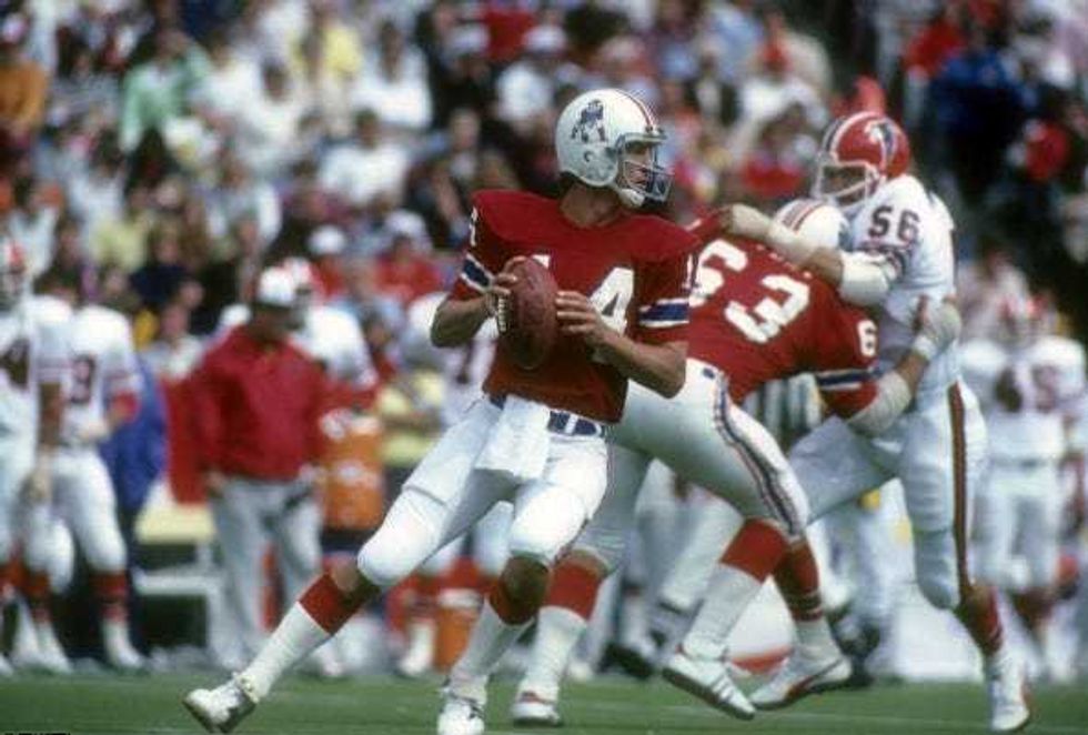 FOXBORO, MA - SEPTEMBER 14: Quarterback Steve Grogan #14 of the New England Patriots drops back to pass against the Atlanta Falcons during an NFL football game at Foxboro Stadium September 14, 1980 in Foxboro, Massachusetts. Grogan played for the Patriots from 1975-90.Focus on Sport/Getty Images
So in 1993, to go along with selecting No. 1 overall in the NFL Draft, the team unveiled a new look for the franchise:
- Royal blue uniform
- Red numbers on the front and back
- White numbers on the shoulders
- Silver pants
- Silver helmet with the “Flying Elvis” Patriots logo that we still see used today
- Silver facemask
On the road, a reverse white version of this uniform was used, with the only difference being the color for the numbers on the shoulders - those were blue instead of white.
Quite honestly, it was pretty ugly look. To go from the iconic AFL reds to this weird hodgepodge of over-the-top 1990s-ness was, well, very 1990s of them. The Patriots were one of a few NFL franchises that incorrectly shifted away from classic uniforms in the 90s, with the Broncos, Eagles and Buccaneers immediately coming to mind as others who followed suit.
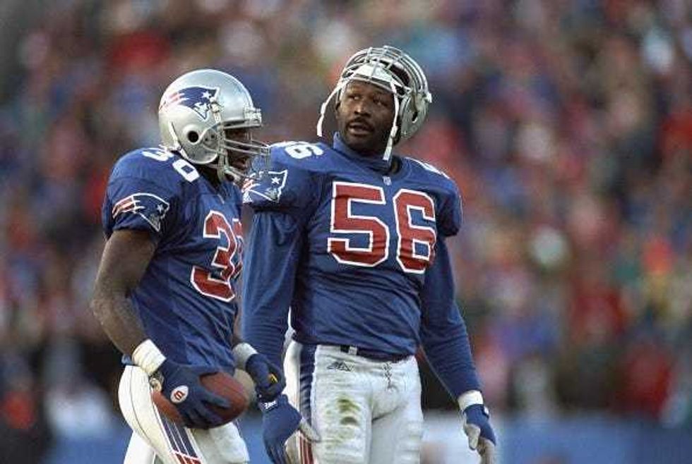 Football: New England Patriots Andre Tippett (56) with Corwin Brown (30) during game vs Buffalo Bills. Foxboro, MA 11/7/1993Damian Strohmeyer/Sports Illustrated/Getty Images
So when the Krafts announced tweaks to their uniform ahead of the 1995 season, it was welcomed with open arms.
“The motivation behind [the tweaks] was that we’ve already gone through a logo change, so we didn’t want to have that done over,” said Jonathan Kraft in the summer of 1995. “We didn’t think that would be fair to the fans. Robert [Kraft] was very involved in the new design.”
If retaining Bill Parcells was the first great decision of the Kraft family’s ownership of the franchise, this tweak to the royal blues was their second.
The numbers on both the front and back were given a 3D font upgrade, akin to what you saw on the classic Lakers jerseys of the 1980s. White numbers with a red shadow of sorts, against that royal blue fabric. It all just popped. And on the chest, just above the numbers on the front, they added the word “Patriots,” stylized with the “Flying Elvis” built into the cursive “P” at the front of the word.
Those same front-back numbers were found on the sleeves, with an oversized “Flying Elvis” logo taking the place of the numbers on the shoulders.
The pants remained silver, with some simplifications to the striping on the side. And while the helmet remained the same, the facemask went from silver to red.
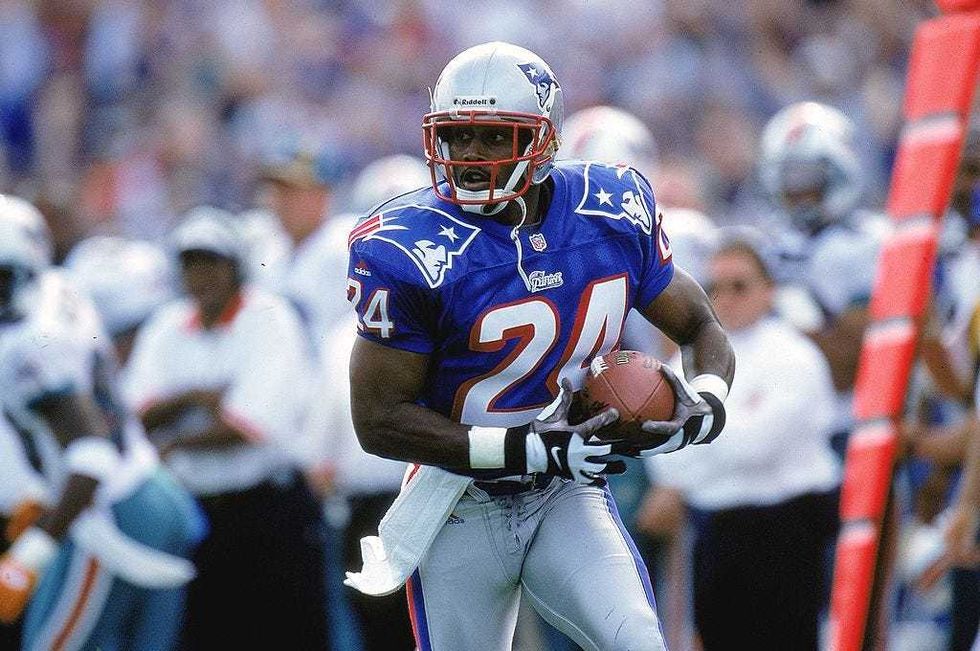 17 Oct 1999: Ty Law #24 of the New England Patriots carries the ball during the game against the Miami Dolphins at the Foxboro Stadium in Foxboro, Massachusetts. The Dolphins defeated the Patriots 31-30.Getty Images
They nailed it.
From 1995 to 1999, the team wore this loud get-up during a mini renaissance period for the franchise - one that saw them go to the Super Bowl in 1996, and lay the groundwork for what would eventually become the dynasty defense of the early 2000s under Bill Belichick.
But in 2000, the team made yet another change, scrapping the flashy uniforms for the muted navy blue kits we all became very familiar with during Belichick and Tom Brady’s double-dynastic run together through the end of the 2019 season.
The internet tells me that this was done in an effort to “modernize” their look. And while that may have been true at the time, it appears - like everything in fashion - that old is new again.
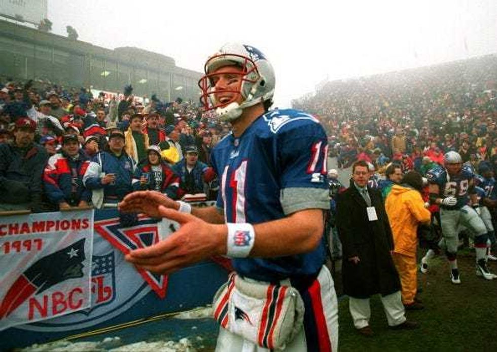 FOXBOROUGH, MA - JANUARY 5: Drew Bledsoe is pumped, as is the crowd, as he comes out for the introductions before the Steelers game at foggy Foxboro Stadium.Jim Davis/The Boston Globe/Getty Images
With the blocky “color rush” era uniforms the Patriots have been wearing since the 2020 season yielding a 33-51 record with one playoff appearance, it may be time to switch things up again.
If the team unveils some sort of uniform that combines the look of the dynasty teams with the Drew Bledsoe-era blues that we all know and love, it would be a home run for a franchise that’s slugging percentage is way down since Brady left for Tampa in March of 2020.